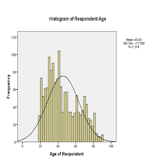
Describe and Explore your Data with Histogram Using SPSS 16.0
With SPSS Program, you can describe and explore your data using different types of graphs, such as histogram
, bar graphs, scatterplots, boxplots, and line graphs. At the moment, I will explain how to create a histogram. Histogram is used to display the distribution of a single continuous variable, like age and Likert-type scores.
- From the menu at the top of the screen, click on Graphs, then on Histogram.
- Click on your variable of interest and move it to the Variable box (e.g. age).
- Click on Display normal curve. This option will give the distribution of your variable and superimposed over the top, how a normal curve for this distribution would look.
- If you want to give your graph a title click on the Titles button and type the desired title in the box (e.g. Histogram of age).
- Click on Continue, then OK.

Reading the output:
Inspection of the shape of the histogram provide you with the information about the distribution of scores on the continuous variable. In this example, the scores are not reasonably normally distributed, with most scores occurring in the center. However, it is common to find data not normally distributed in the social sciences. This issue is well-discussed in the normality part of statistics books.
0 comments:
Post a Comment