Describe and Explore your Data with Bar Graph Using SPSS 16.0
Bar graphs
can be simple or very complex, depending on how many variables are included. Bar graph can be
used to show the number of cases in particular categories or it can show the score on some continuous variable for different categories.
Procedure for creating a bar graph:
- From the menu at the top of the screen click on Graphs, then Bar.
- Click on Clustered.
- In the Data in chart are section, click on Summaries for groups of cases. Click on Define.
- In the Bars represent box, click on Other statistics (e.g., mean).
- Click on the continuous variable you are interested in (e.g. confidence in press). This should be appear in the box listed as Mean. This indicates that the mean on the confidence in press for different groups will be displayed.
- Click on your first categorical variable (e.g. agegp3). Click on the arrow button to move it into the Category axis box. This variable will appear across the button of your bar graph (X axis).
- Click on another categorical variable (e.g. sex) and move it into the Define Clusters by: box. This variable will be represented in the legend.
- Click on the Options button. Remove the tick from Display groups defined by missing values. To do this, click once on the box.
- Click on OK

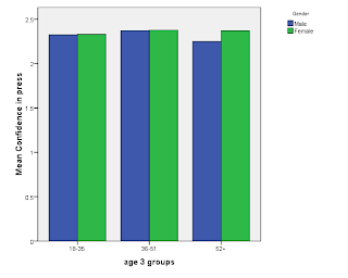
Reading the output: The output from this procedure shows a summary of the distribution of scores for the groups that have been requested (i.e. males and females from the different age groups). The graph presented above suggests that females had slightly higher confidence in press than males, and that this difference is more pronounced among the two older age groups. Among the 18 to 35 age group and 36-51 age group the difference in scores between males and females is very small.
2 comments:
Can you explain how to transfer continuous variables into categorical data?
along similar lines, i reorganized my data set so that the y-axis means are categorized by different groups. i did this by listing all the means in a single collumn and then assigning numbers to means corresponding to different groups. however, when i graph using the procedure you described, it only shows the first group, but not the others. how can i change that?
innuendo92@yahoo.com
Post a Comment